Icon Composer Notes
#An updated version of this is on my longer post blog.
I spent a significant portion of WWDC week trying to understand how to correctly use Icon Composer, and determining how best to carry forward Unread’s alternate icons feature with this year’s changes.
Thank You
I want to thank Kaya Thomas, who helped me understand some aspects of Icon Composer that were not initially clear to me. I also want to thank the Apple engineers who helped me in two different lab sessions.
A Quick Tutorial to Using Icon Composer
I would not have figured out how to use this tool without help, so I wanted to pass along the correct way to use it. I will use Unread’s icon as an example, since it is a simple icon with three single-color shapes.
Step 1. Start with the shape.
Start with the shape as a 1024x1024 vector image file, with a white foreground color and a transparent background.

Just pretend the light gray color is white. I needed the white to be visible regardless of the webpage background color.
Step 2. Divide the icon up into individual layers.
Divide the icon up into individual layers. The shape should be a solid white. Make the foreground color white and the background color transparent. Export each as a PNG file.
Important: The WWDC “Create icons with Icon Composer” talk recommends using SVG files. If I follow that advice and use SVG files, I do not get the liquid glass effects as expected. I recommend using PNG files instead.


Step 3. Create a new icon in Icon Composer.
Open Icon Composer and create a new icon.
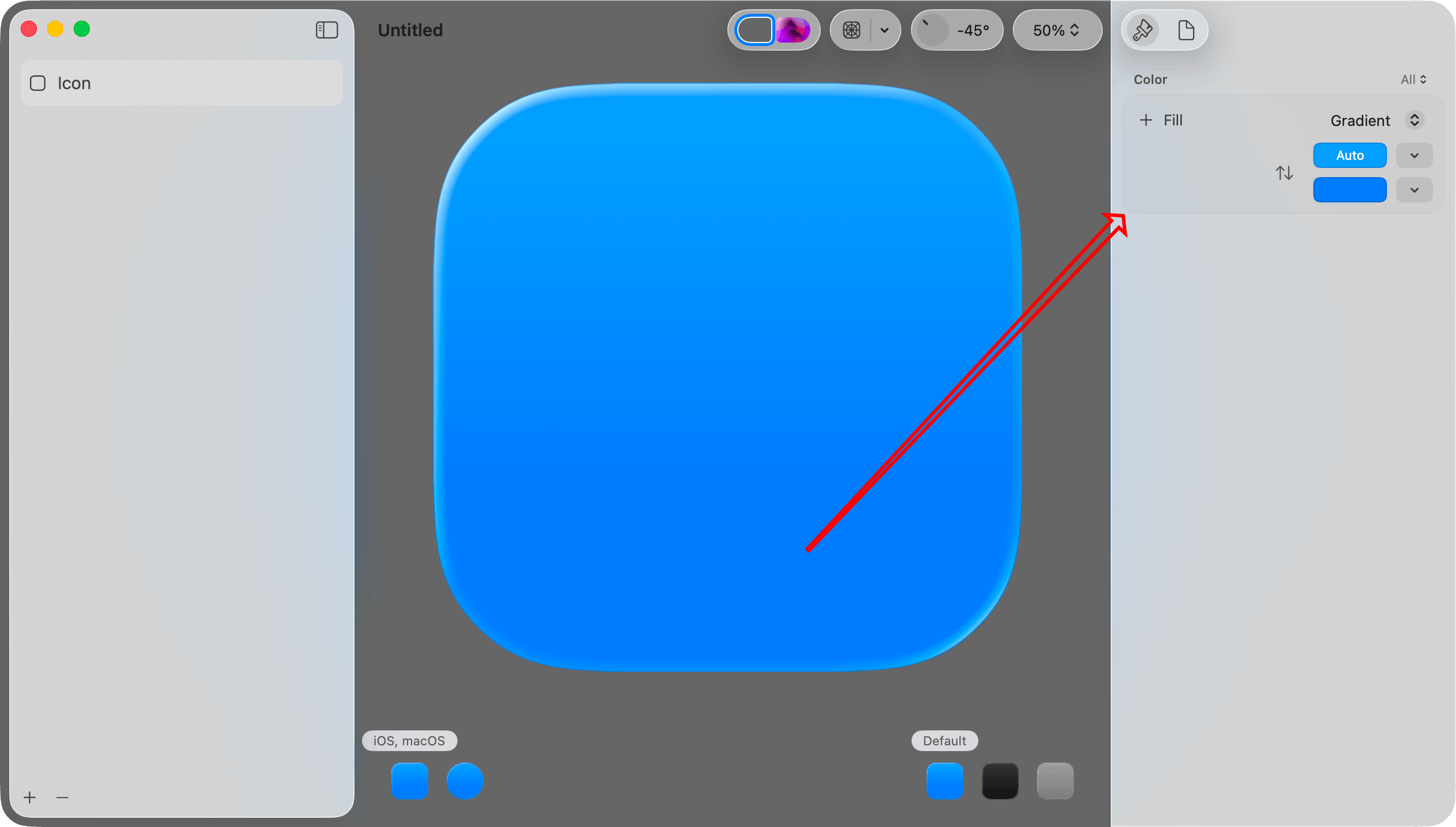
Step 4. Set the background color for the light mode version.
You can set Fill to Automatic, Solid, Gradient, System Light, or System Dark.
Automatic seems to mean System Light when in light mode, and System Dark when in dark mode. System Light is a near-white color. System Dark is a near-black color.
If you choose Gradient you can set the starting and ending colors. If you choose Solid you can choose the solid color.
I will choose System Light here, mostly because I want to demonstrate how to set the light mode and dark mode background colors separately.
Step 5. Set the background color for the dark mode version.
First, click the Dark Mode icon in the lower left corner.
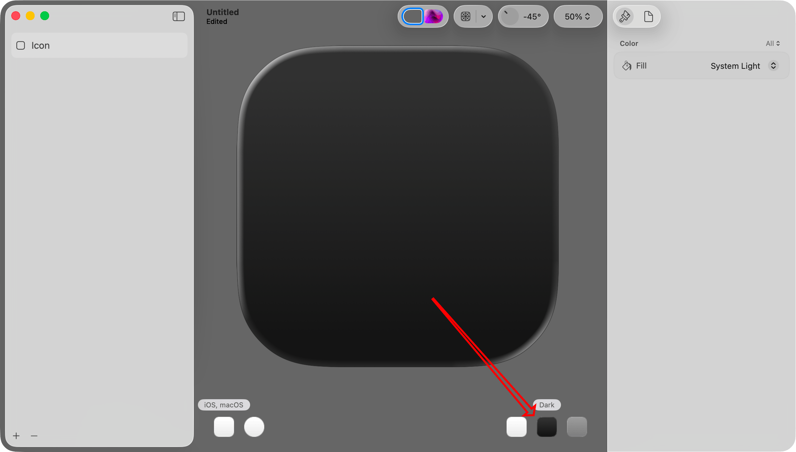
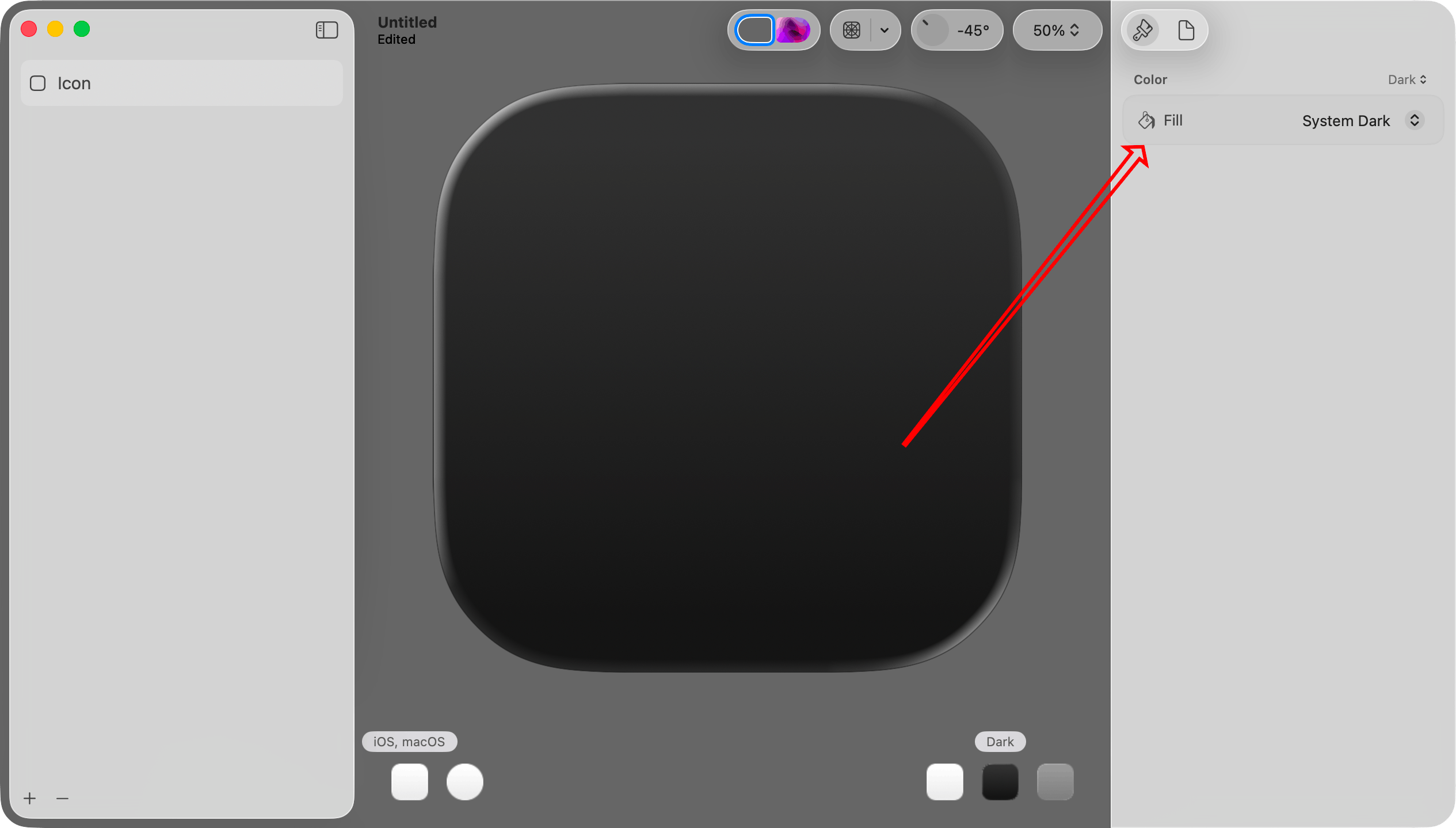
Then, at the very top right, set Color to Dark. This will make the color selection apply only to the dark mode version.
Finally, choose a Fill setting. Since Color is Dark, this setting will apply only to the dark mode version. I will set this to System Dark.
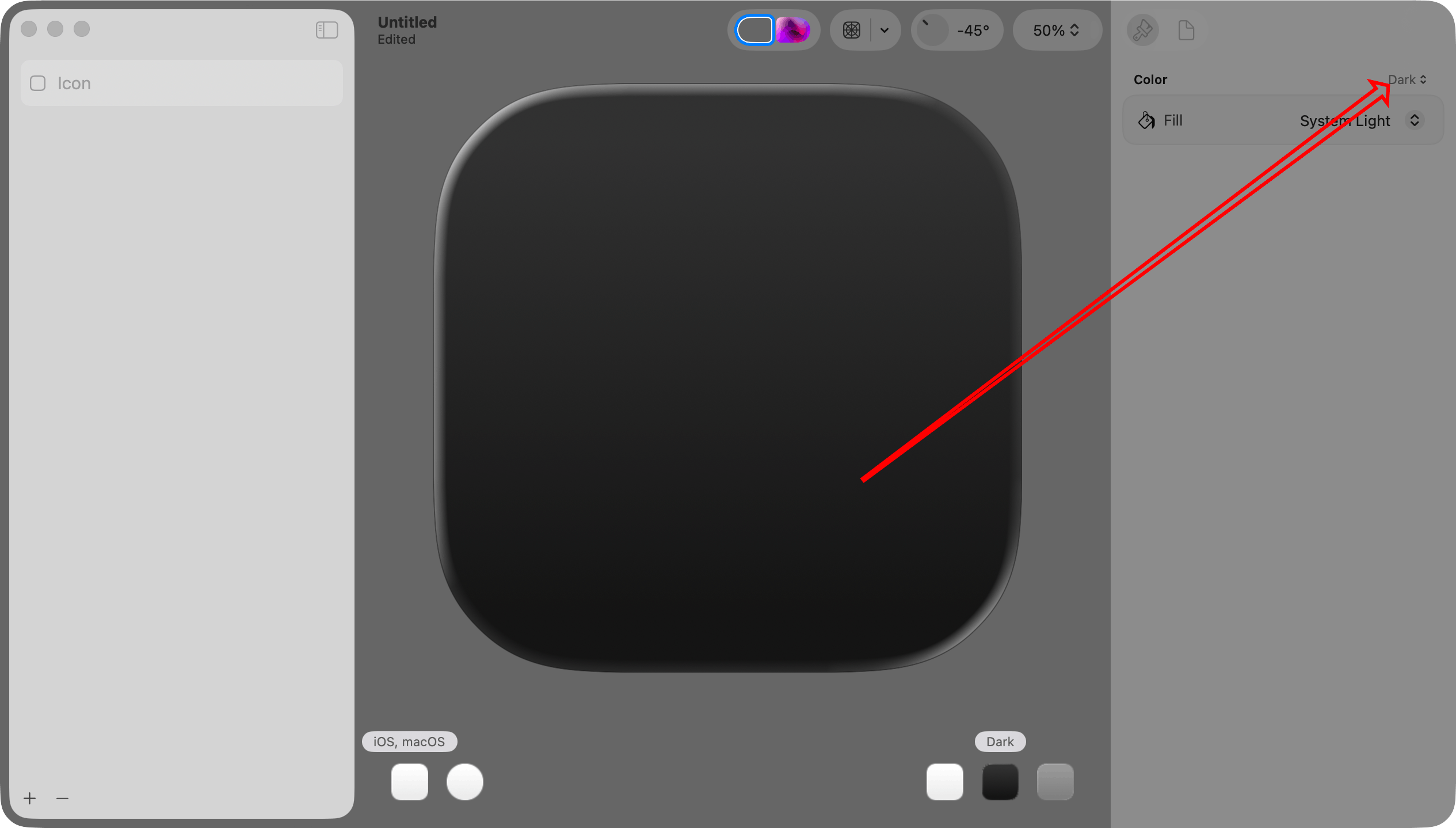
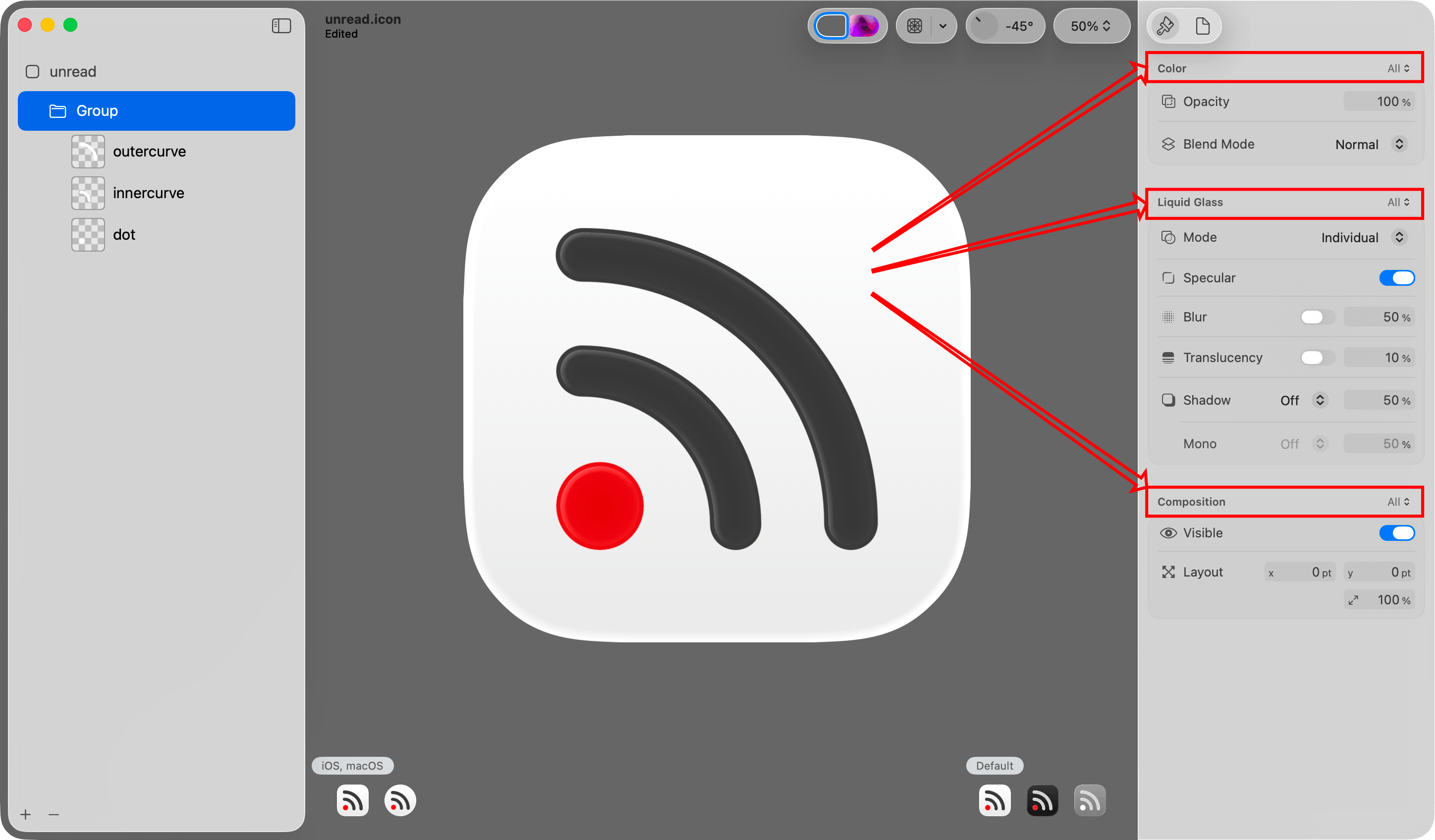
Important: This step illustrates a concept that I did not immediately understand. When you want to work with the light mode, dark mode, or mono version of the icon, you select it in the lower right portion of the canvas.
When you want to make a color change specific to the light, dark, or mono version, choose it in that Color menu at the top of the inspector pane on the right.
Each group of settings in the inspector pane on the right has its own menu. In this set of steps I work exclusively with the Color menu, but there are others as well.
Step 6: Add the layer PNG files.
Drag and drop the layer PNG files created in step 2 onto the icon.
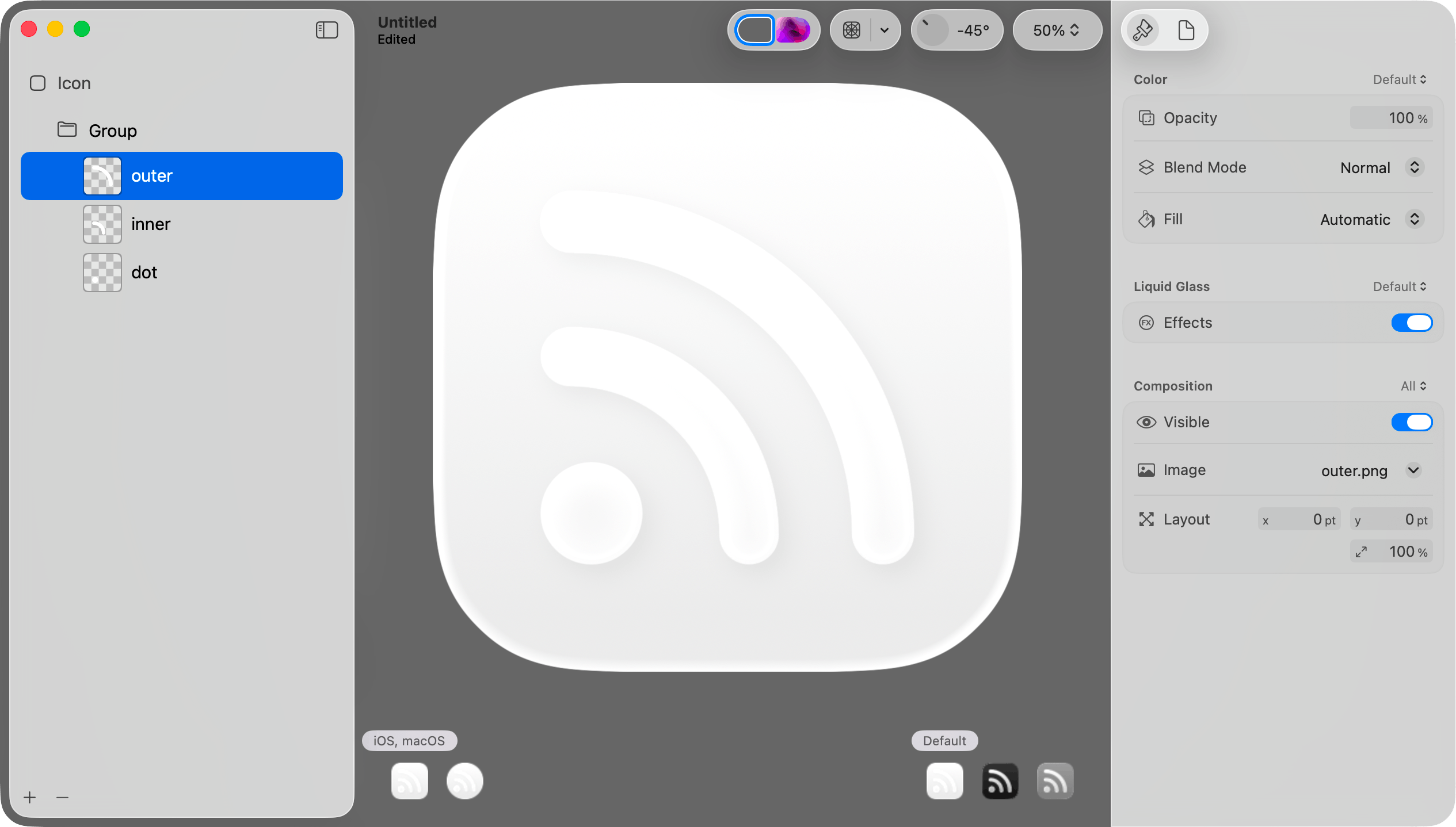
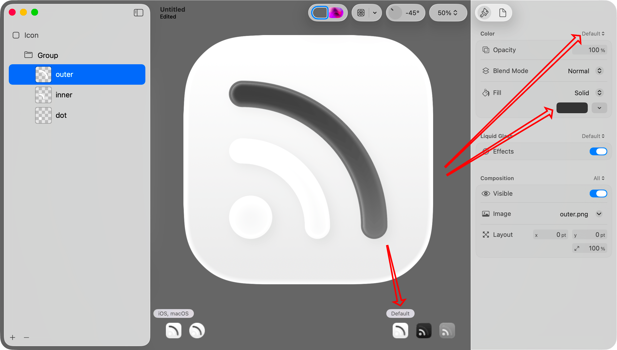
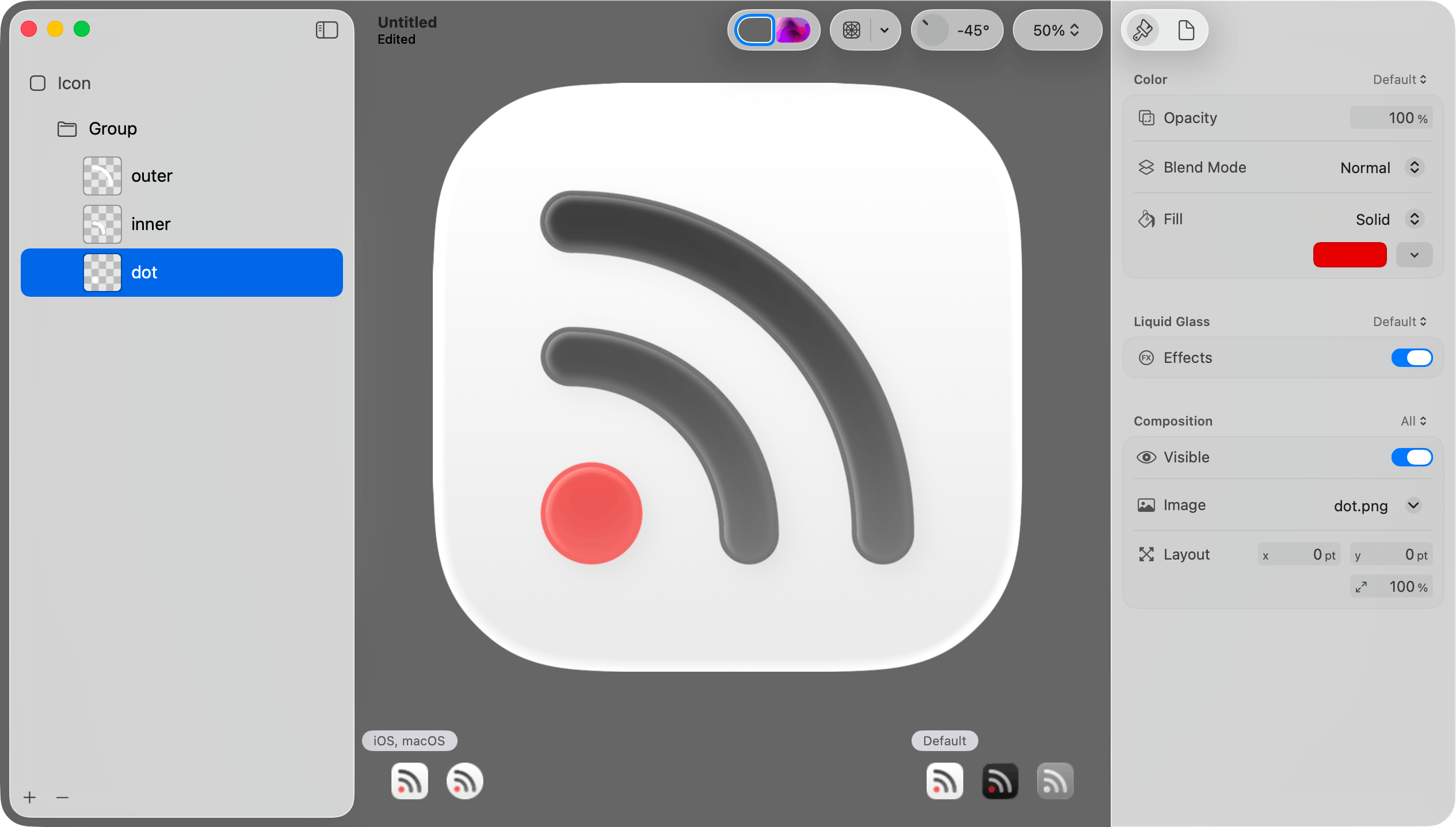
Step 7: Set the default/light mode color for a layer.
Select Default in the lower right portion of the canvas. Select a layer in the sidebar. Choose “Default” in the Color picker at the top of the inspector. Then choose a color in the Fill picker in the inspector pane on the right.
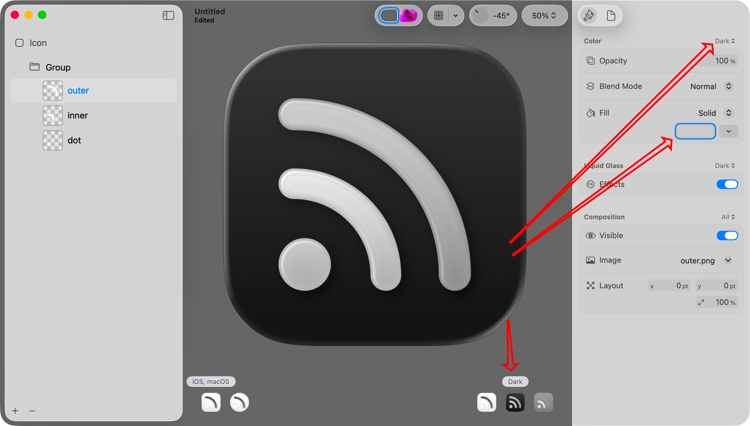
Step 8: Set the dark mode color for that layer.
Select Dark in the lower right portion of the canvas. Choose “Dark” in the Color picker at the top of the inspector. Select the same layer on the left. Then choose a color in the Fill picker in the inspector pane on the right.
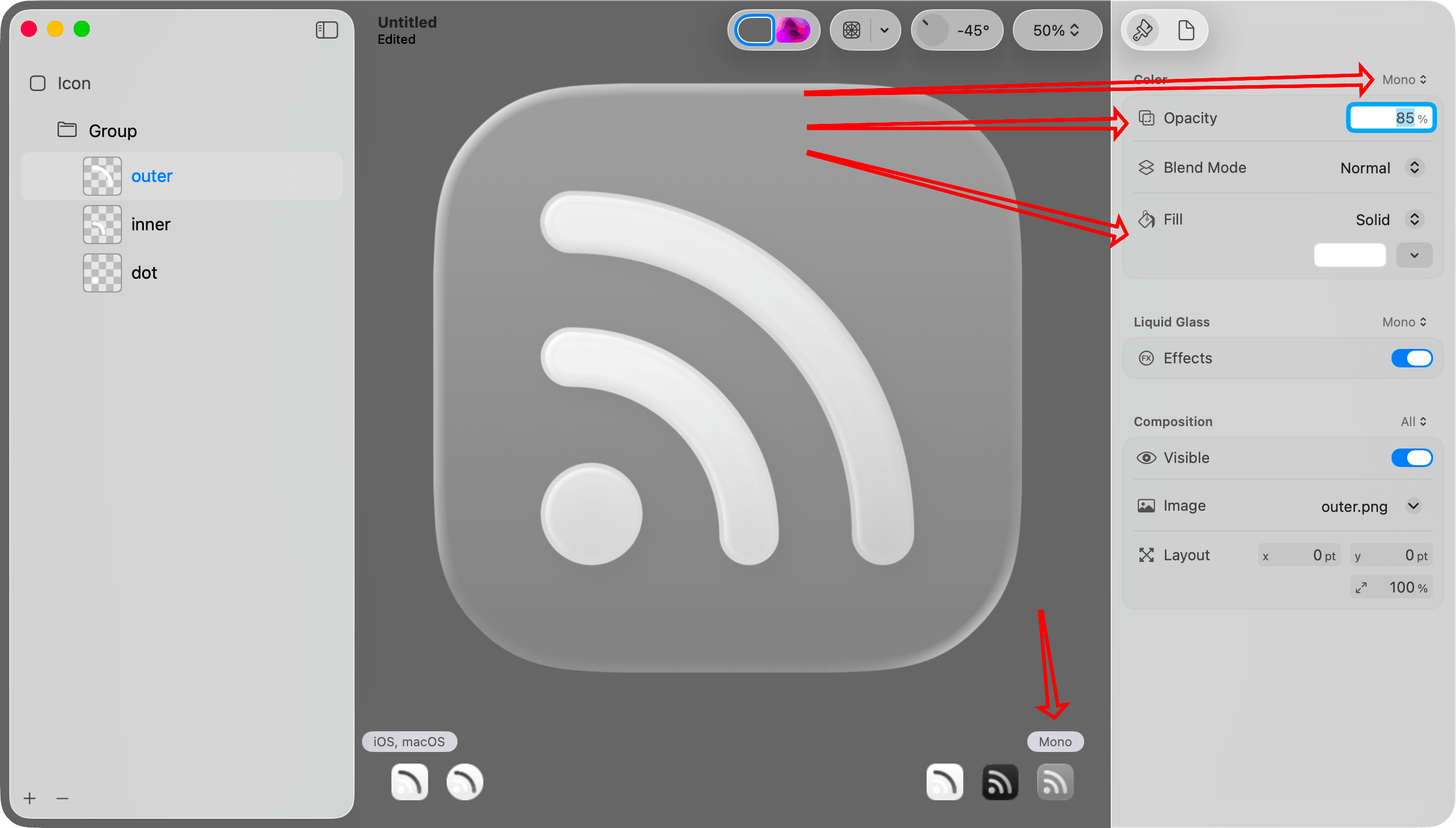
Step 9. Set the mono color and opacity for that layer.
Select Mono in the lower right portion of the canvas. Choose “Mono” in the Color picker at the top of the inspector.
It is monochrome, so I think it is best to set the color to pure white. If you want the layer to be dimmer than others, set the opacity to something less than 100%.
Step 10. Repeat for other layers.
Repeat steps 7 through 9 for each of the other layers.
If you look at the icons in the lower right portion of the canvas, you can see that each now looks reasonable.
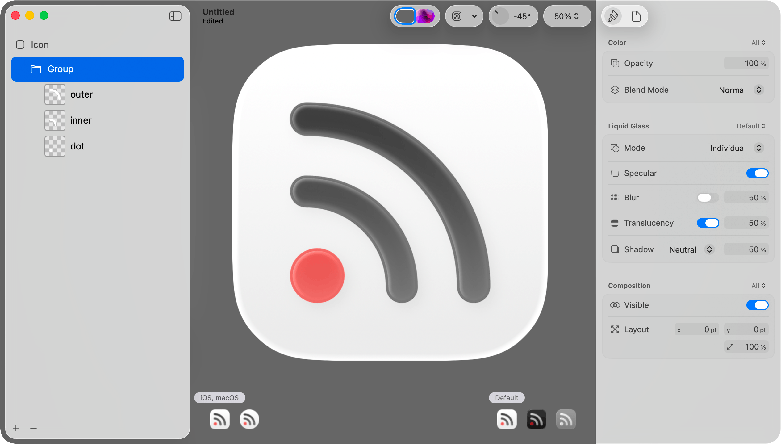
Step 11: Adjust effects on all layers in the group.
When I imported the layers, Icon Composer put them into a group. When I select that group, I can change various effects for all layers in the group. I can also move layers into different groups.
Above each group of options in the inspector pane is a menu letting you determine whether the settings should apply to all versions or just the currently selected version (default, dark mode, or mono).
Step 12: Save the file.
Choose Save from the File menu to save the icon as a .icon file. Then add that icon to the Xcode project.
Important: Do not choose Export from the File menu. That will save to a PNG file. That will be useful in other contexts, but not when adding the default icon to the app.
The .icon file format
The .icon file is a package (a folder that convinces Finder to treat it like a single file). You can open it in Finder by right clicking and choosing Show Package Contents from the resulting menu.
When you do that, you will see that your layer images are saved in an Assets subfolder. The structure of the icon itself is specified in an icon.json file. Unread has 32 different alternate icon options. Each icon has the same shapes but uses different color combinations. I plan to automate generating these icon files based on lists of color combinations.
Alternate Icons on iOS
If your iOS app supports alternate icons, you set icons the same way you did with the prior icon format. Add the .icon files to the Xcode project. The alternate icons still need to be specified the same way in the Info.plist file. The Include All App Icon Assets setting still needs to be set to Yes in Xcode Build Settings.
If you let customers choose an alternate icon, you probably need to display the different icons in your app. I did not have success reading icons with UIImage(named: String). One could draw the icons in code, but mimicking the different effects on the image would be difficult. I think the best way for most is to export the icons to PNG files, and use those PNG files in the app to display the icons.
There is still no way to let a customer choose one icon for light mode and a different icon for dark mode.
You can export an icon to PNG file by choosing Export from the File menu.
Alternate Icons on macOS
On macOS, one sets an alternate icon by either setting NSApplication.shared.applicationIconImage to an NSImage or drawing it in code using the NSDockTile API. I believe Mac apps have no access to the system-wide Icon & widget style setting or the current tint color.
You can create an icon using NSImage(named: String) and display it in the app with an NSImageView. If the icon has any variation between the light mode version, dark mode version, or mono version, the image drawn shows the mono version.
When I add multiple .icon files to a Mac app, Xcode seems to only include the app’s default icon. It seems to ignore the others. The icon is included as a .icns file that appears to be generated from the .icon file. It is probably possible to generate those .icns files some other way and include those as resources.
The content view for an NSDockTile is always 128x128. Therefore if you decide to store the icons as PNG files, 256x256 image files should be sufficient.
Alternative dock icons for Mac apps are only used when the app is running.
Automating Exports of Icon Files to PNG Files
Icon Composer contains an icontool executable that you can use on the command line to generate PNG files from .icon files created with Icon Composer. It is at this path under the Xcode app bundle:
Contents/Applications/Icon Composer.app/Contents/Executables/icontool
From a directory containing an unread.icon icon file, I was able to make icontool generate a 256x256 PNG file for macOS by invoking it as follows:
"/Applications/Xcode-26.0.0-beta.app/Contents/Applications/Icon Composer.app/Contents/Executables/icontool" unread.icon --export-preview macOS Light 256 256 1 unread.png
My Plan for Unread
Today icon selection in Unread works as follows:
On Mac, the customer can choose between one of 32 different icons.
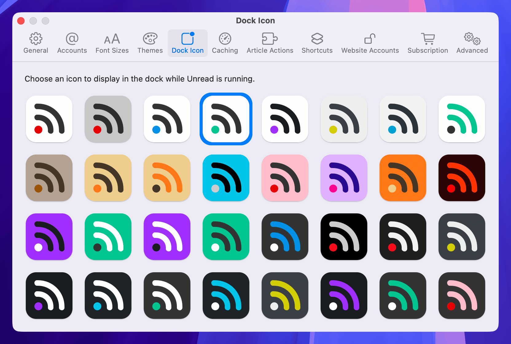
On iOS, the default icon has a light mode version and a dark mode version. All icons have the same mono version for tinting.
![]()
My plan for Unread is:
- Make the default icon on Mac the same as it is on iOS with a light mode version and a dark mode version.
- Each of the 32 alternative icons on Mac will have a constant color palette, without light, dark, or mono versions.
- Automate generating each of the 32 alternate
.iconfiles and their exported.pngfiles.
Feedback Assistant Reports
If anyone at Apple happens to read this, these are relevant Feedback Assistant reports:
- FB18097334: Icons with SVG layers do not get the liquid glass effects as expected
- FB18096324: macOS needs an equivalent to UIApplication.shared.setAlternateIconName(…)
- FB18093372: In macOS apps, no way to include additional Icon Composer-generated .icon files
- FB18091397: On macOS, showing an Icon Composer-generated icon in the app via NSImage and NSImageView shows the monochrome version
- FB18027769: Creating a UIImage from a .icon file created with Icon Composer does not work
- FB13999626: iOS Home Screen Personalization and Alternate Icons
Update 2025-06-22: Added note that an alternative icon on macOS can be set by setting NSApplication.shared.applicationIconImage to an NSImage, and that alternative icons for Mac apps are only shown in the dock while the app is running.